NOW:Pensions
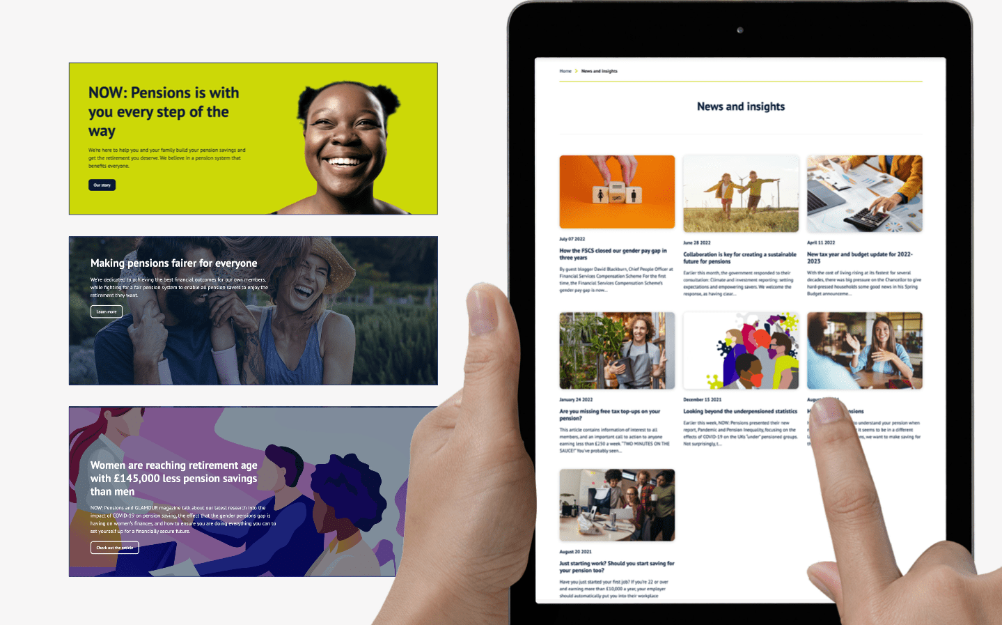
Using world-class insight for a website redesign to create the best customer experience and service for a leading pension provider.

Complicated
Now:Pensions, a leading auto-enrolment pensions provider, believe in “fair pensions for all”, whether that’s part time on lower incomes, or higher earners in fixed roles. The website is their vital point of contact for members to access their pensions and gather information. A poor web experience was resulting in a high volume of call centre contacts and negative sentiment. We set off to understand user needs and their challenges to redesign and rebuild the experience.
Simple
We identified the most common questions and problems faced by call centre staff via analysing the existing website and interviewing senior staff and stakeholders. The discovery phase highlighted the key requirements of the website, education, and information around the complexity of auto-enrolment, including opt-out options. We set out to communicate the regulated pensions messaging to a variety of audiences in the simplest way possible – this was reflected in how we made the website through it’s easy to use and intuitive design. We could reduce time and resource used in call centres by providing customers access to easily digestible content, and answers to their most frequent questions.
Results
The success of the project was measure by two interlinked sets of metrics, the first was how the engagement with the website had increased across page views, time spent on site and critical pages, and visible journeys logging into member areas. The second was a reduction in calls to the centre teams. Within three months the website engagement results were a resounding success with a 66% of YoY increase in traffic and a 7.2% increase in engaged sessions. The call centre metrics were even more resounding with a 21% reduction in calls and saving of 331 hours per month.


